Filtering #
If there is a lot of data in the database, it is often necessary to focus only on what is really important and needed right now. For these purposes, we have added the ability to filter data based on various conditions.
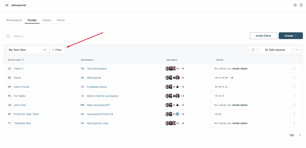
How do I enable filtering? #
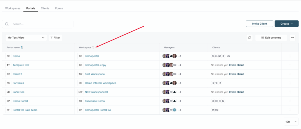
To activate filtering, click on Filter –
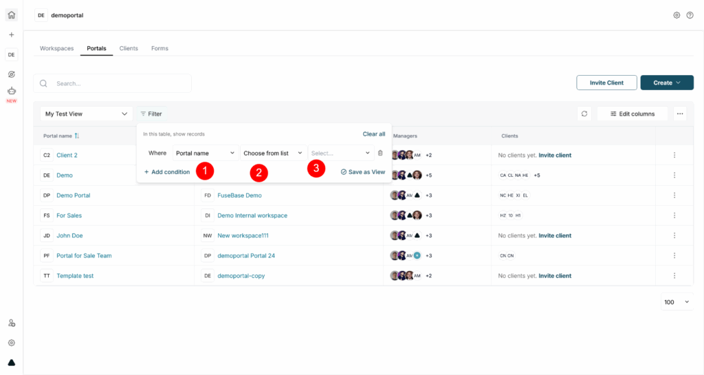
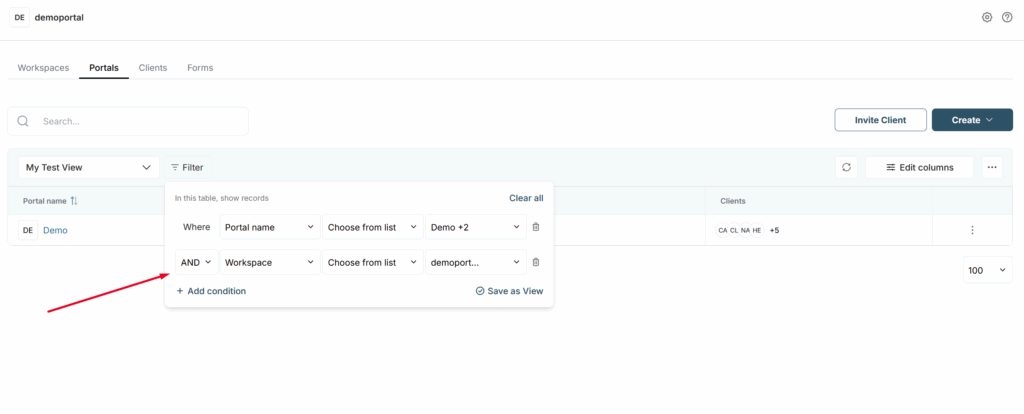
Next, you will see the filtering bar. Here, you can:
- choose a column to filter by (1);
- choose the filter condition (2);
- specify the filtering value (3).
How do I enable multi-column filtering? #
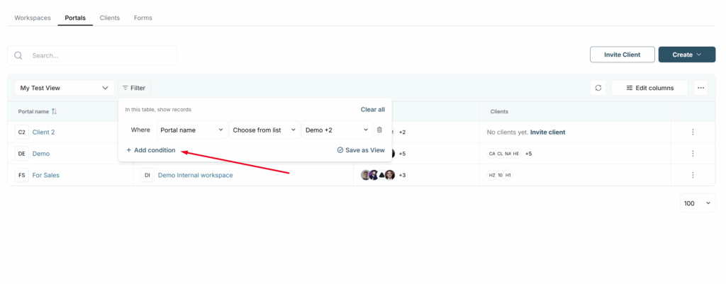
You can also utilize multiple filters. To do this, open the filter bar, and click Add condition. Then enter the filter values.
OR/AND operators #
If you use multiple filtering, you can use OR / AND operators to make filtering more accurate.
If the OR filter is selected, the table only shows rows that match ALL filters simultaneously.
If the filter AND was chosen instead, only rows that have a match for all the selected filters should show up. In our case, one row.
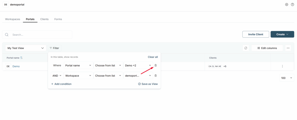
How do I remove the filter? #
You can remove a filter by clicking on the trash can icon next to the filter.
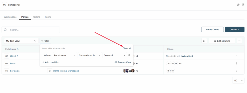
You can also remove all filters by clicking Clear all.
Columns and filter types #
Below is a list of columns and filter types.
Text column #
Filter conditions #
- Contains (default) – shows the strings that contain part of the input. For example, if John, then we show the string, John Doe;
- Is – shows rows with exact values in the cell column. For example, if the cell says John Doe. Then John Doe must be in the filter. Otherwise, it is not shown;
- Is not – show rows in which there is no exact match in the text. For example, if the cell says John Doe. Then the filter should be exactly John Doe. Otherwise, the line will be shown. This filter is case-sensitive;
- Contains not – shows rows in which there is no specified content. For example, if John is specified, the line with John Doe is not shown;
- Start with/End with – shows rows that start or end with the specified value
- Empty/Not empty – shows lines with any data or vice versa.
Filter value #
A text input box where enter the desired text.
Single / Multiple Select #
Filter conditions #
- Has any of (default) – show all lines with selected labels (there can be multiple labels). If the value has more than one label, at least one label must meet the conditions;
- Has none of – show all lines with none of the selected labels (there can be multiple labels);
- Empty/Not empty – displays lines with any labels and vice versa.
Filter values #
In the value, you can select the desired labels for which you want to enable filtering. You can select multiple labels at once.
Number / Currency #
Conditions #
- Equal – rows whose values are equal to the selected one are displayed;
- Not equal – the rows whose values are not equal to the selected one are displayed;
- More – the rows whose values are greater than the selected one are displayed;
- Less – the rows whose values are less than the selected one are displayed;
- More or equal – the rows whose values are more or equal to the selected one are displayed;
- Less than or equal – the rows that are less than or equal to the selected one are displayed;
- Empty/Not empty – rows with any numbers and vice versa are displayed.
Values #
You can enter a numeric value in the format selected for the column. This includes negative digits.
Files #
Conditions #
- File type – here, you select the file type (the list in the conditions). For example, you can select multiple values to filter rows that have both documents and pictures.
- Empty/Not empty – displays rows with any files and vice versa.
Values #
You can select different file types:
- Images: png, jpg, jpeg, gif files;
- Documents: doc, pdf, xls, html, txt;
- Media: mp4, mp3, mov, avi, webm;
- Other: all other file types.
Checkbox #
Conditions #
Is – checkboxes have only one condition: the checkbox is marked as done or not.
Value #
Depending on the status change, the displayed lines are updated.
Date #
Conditions #
There is only one condition for a date – it must match the selected time value. After filtering, the rows that match the selected values are displayed.
Values #
Dropdown list with values. You can select multiple values (for example, Today and a Custom date).
- Today – cells with dates where today is specified;
- Yesterday – cells with yesterday’s date;
- Tomorrow – cells with tomorrow’s date;
- Custom – opens the calendar where you can select:
- specific day;
- period, for example 1st June – 7th June.
You can also choose to display rows where there are empty values (date not selected).
Links #
Conditions #
- Contains (default) – shows the strings that contain part of the input. For example, if Nimbus web, then we show the string, nimbusweb.me. You can search both by link name and by URL;
- Is – shows the rows with the exact values in the cell column. For example, if the cell reads nimbusweb.me. Then the filter must contain nimbusweb.me. Otherwise, it is not shown;
- Is not – shows rows in which there is no exact match. For example, if the cell says mail.com. Then the filter should be exactly mail.com. Otherwise, the string will be shown. This filter is not case-sensitive. Search by both the name of the link and the URL;
- Contains not – shows rows in which there is no specified content. For example, if you specify nimbus web, the string with nimbusweb.me is not shown. You can search both by link name and URL. This filter is not case-sensitive;
- Start with/End with – shows rows that start or end with the specified value
- Empty/Not empty – shows rows with any data or vice versa.
Value #
Text injection where necessary text can be entered.
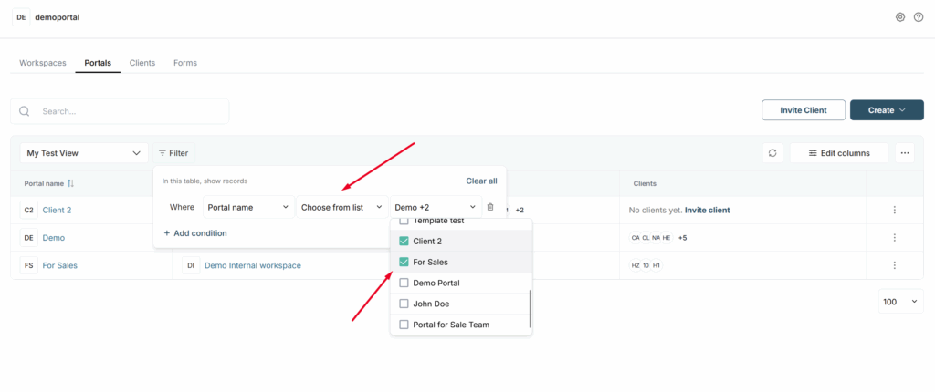
Filter Choose from list #
Also, for a number of columns, the Choose from list filter is available. It allows you to select specific rows from the database and display only them. This is a great option for creating segments. For example, you can create separate Views and display only the rows you need in them.
Sorting #
You can create databases with different information in columns and sort columns by different criteria.
Try to sort:
- from smaller to larger numbers in digital columns;
- all completed / non-completed tasks in columns with checkboxes;
- percents of the work done in columns with progress.
Number columns can be sorted from smaller to larger numbers; in columns with checkboxes, you can show all uncompleted tasks first; and in columns with progress, you can sort tasks by percent of completion.
To change the sorting, simply click on the sorting icon next to the column name. Clicking the same icon again changes its type, for example A-z switches to z-A and vice versa.
If you want to sort by another column, then click on the sorting icon in that column (the sorting icon will appear when you hover over the column).
In Fusebase sorting is dynamic, so if you change data in the cell of the column being sorted, the row automatically changes its place.
Below are examples of the principles by which data is sorted in columns of different types:
Text – sorted alphabetically.
Numbers and currency – sorted from smaller to larger items and vice versa.
Checkboxes – you can show marked checkboxes on top or vice versa.
Select and multiselect – sorted alphabetically by the first selection on the list.
Date – sorted from an earlier to a later date and vice versa.
Links – sorted alphabetically by domain.
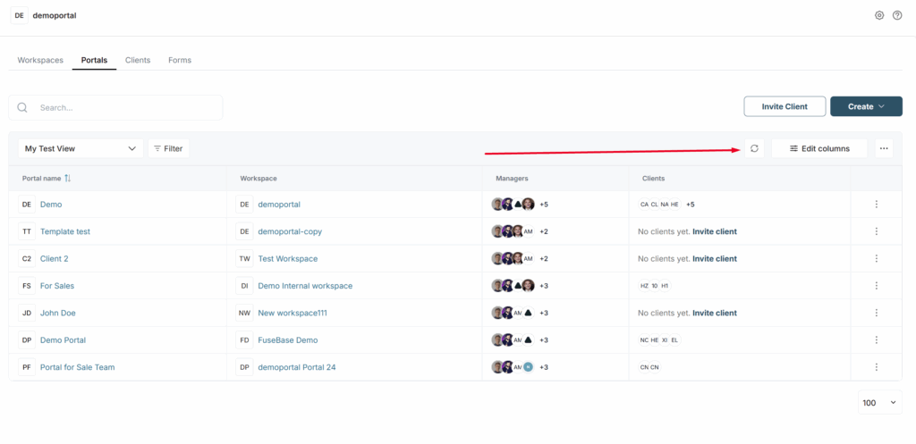
Refresh button – what it does and why it’s needed #
In the top bar of the dashboard, you can see the data refresh button. The built-in CRM does not have real-time data updates (for example, if another member invites a client or creates a portal, it will not immediately appear in the list until you refresh). To avoid refreshing the entire page, you can simply click on the icon, and you will always have up-to-date data.